
How to Choose Party Colors That Actually Look Good Together
Picking a party theme is usually the easy part. Then you start shopping.
Suddenly you’re trying to decide whether the plates should match the napkins, whether you need every color in the decorations, and whether that shade of pink is close enough to the pink on the invitation.
And yes, apparently there can be a very important difference between Red Rose and Dusty Rose.
Years ago, I worked at a local party store called Party Time, and the owner, Joann, was incredibly good at helping customers put a party together. One of the things I learned from her was that you don’t need to buy every matching piece from a themed collection.
Instead, we’d look at the pattern or theme, pull out a few coordinating solid colors, and use those throughout the rest of the party.
It’s a simple trick, but it’s still how I think about party decorating today.
My Simple Formula for Choosing Party Colors
You don’t need to be an interior designer or understand an entire color wheel to put together a pretty party.
My basic formula is:
2–3 main colors + 1 neutral + a few themed accents
The main colors create the look. The neutral gives your eyes somewhere to rest. And the themed pieces are what tell everyone what you’re celebrating.
That last part is important.
If you’re throwing a luau, everything doesn’t have to have a hibiscus flower on it.
You can use turquoise plates, coral napkins, natural woven chargers and green foliage, then bring in the tropical theme with a few leis, flowers, signs or printed pieces.
The result usually feels much more put together—and you may end up with party supplies you can actually use again.
Start With One Thing You Love
If you’re staring at a blank slate, don’t try to invent a color palette from scratch.
Start with something you’ve already chosen.
It could be:
- an invitation
- a package of themed napkins
- a centerpiece
- a tablecloth
- a balloon set
- a favorite decoration
- even a photo you saved on Pinterest
Look closely at it and identify the colors you see.
You don’t need to use all of them. Choose two or three that you like the most, and those become the foundation of your party.
Then add a neutral such as white, warm white, cream, black, tan or natural wood.
A Little Color Theory Helps—But Don’t Overthink It
There really is a reason some color combinations immediately feel right while others seem slightly off.
You don’t need a degree in color theory to use a few of the basic ideas.
Contrast creates interest. Light and dark colors together—like black and cream—give a party definition.
Warm and cool colors create different moods. Coral, yellow, orange and gold tend to feel warm and energetic. Blues, greens and turquoise can feel fresh and calming.
Neutrals calm everything down. This is probably my favorite trick. When you have several bright colors competing for attention, adding white, cream, black or natural materials can make the whole setup feel more intentional.
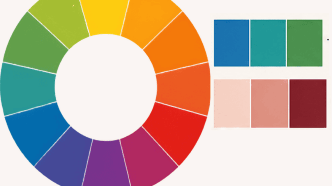
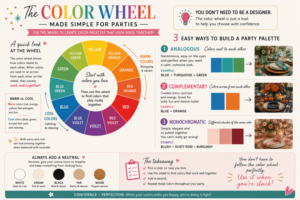
Colors beside each other on the color wheel can also create a softer, harmonious look, while colors farther apart create more contrast and energy.
But if that starts sounding suspiciously like homework, forget the color wheel and go back to the formula. 😂
Pick a few colors you like. Add a neutral. Repeat those colors throughout the party.
That’s really the important part.
Party Color Palette Examples
Here are a few examples of how I’d use this method for very different types of parties.
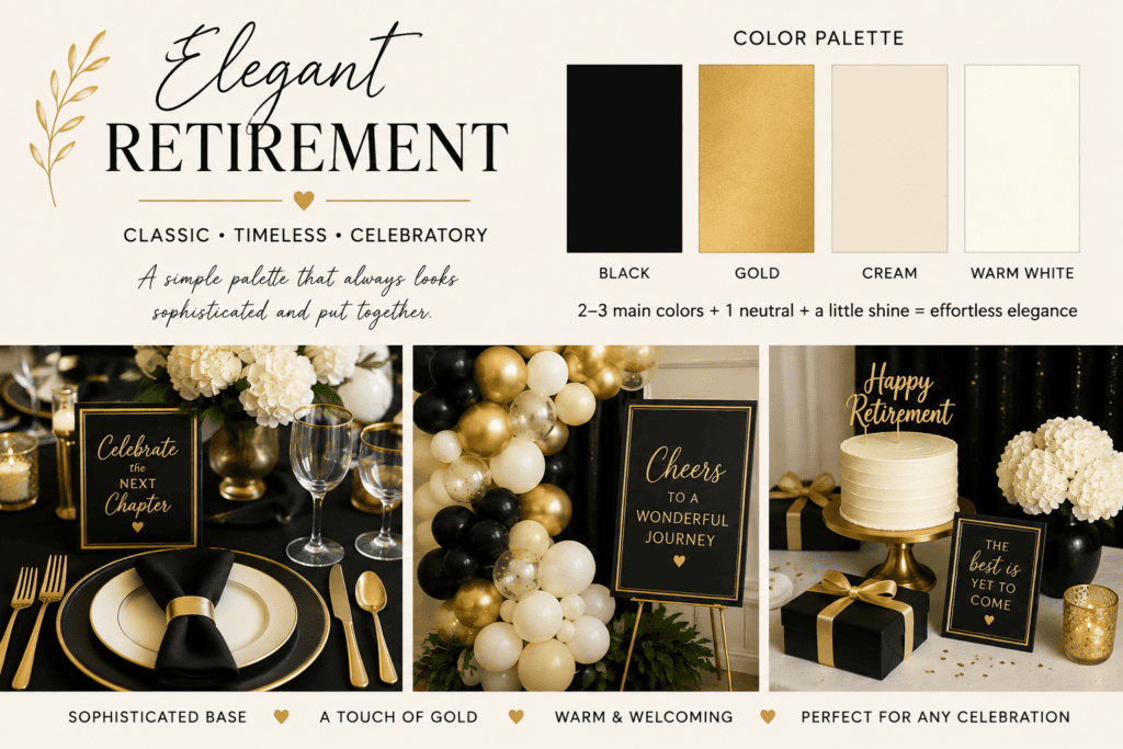
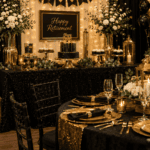
Elegant Retirement Party: Black + Gold + Cream + Warm White
For an elegant retirement party, I’d keep the palette restrained.
Black gives you the strong, sophisticated base.
Gold makes the occasion feel celebratory.
Cream and warm white soften the contrast and keep all that black from feeling too heavy.
Instead of buying black-and-gold retirement-themed everything, I’d use the colors themselves to create most of the look.
For example:
Black napkins or table linens, cream plates, gold flatware or chargers, warm-white flowers and candles, with just a few retirement signs or decorations.
This is also a good example of how metallics can work almost like an accent color. You don’t need gold covering every surface. A little shine goes a long way.
The formula:
Black + cream/warm white + a touch of gold = simple, sophisticated and celebratory.
Shop Solid-Color Party Supplies on Amazon
Choose a color to shop coordinating party supplies.
Some links go to my Amazon Idea Lists. As an Amazon Associate, I earn from qualifying purchases.
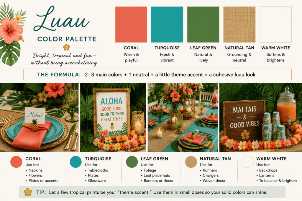
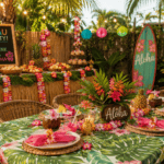
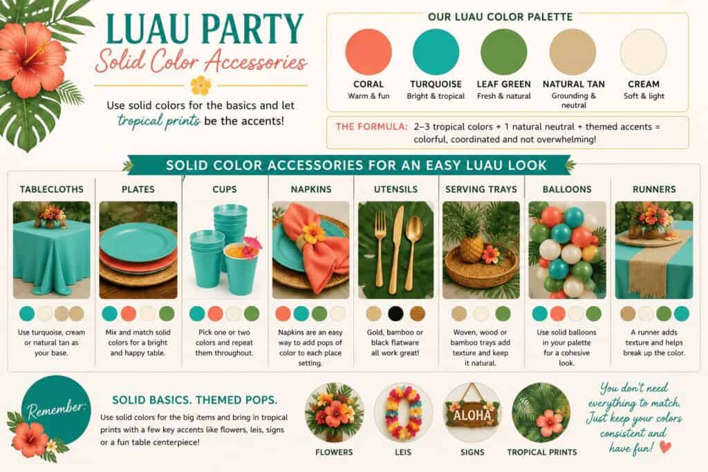
Luau Party: Coral + Turquoise + Leaf Green + Natural Tan
A luau is a completely different mood, but I use the same basic approach.
Tropical decorations often contain a LOT of colors. You could easily end up with pink, orange, yellow, purple, blue, green and every tropical print known to mankind on one table.
Instead, pull out just a few.
I love:
Coral for warmth
Turquoise for that bright tropical-water feeling
Leaf green to bring in the foliage
Natural tan to ground everything
Then tropical prints become the accent rather than the entire party.
You might use turquoise plates, coral napkins, woven or rattan chargers, lots of green leaves, and then bring in hibiscus flowers, leis or tropical-print pieces here and there.
The formula:
2–3 tropical colors + a natural neutral + a little tropical print = colorful without becoming chaotic.
Shop Solid-Color Party Supplies on Amazon
Choose a color to shop coordinating party supplies.
Some links go to my Amazon Idea Lists. As an Amazon Associate, I earn from qualifying purchases.
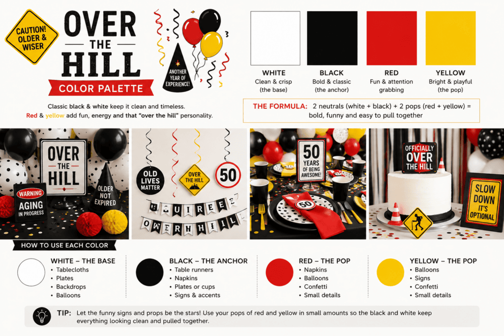
Over-the-Hill Party: Black + White + Red + Yellow
This is where I would treat the colors a little differently.
Looking at typical Over-the-Hill decorations, black and white are really the main palette. Red and yellow are secondary colors that create the warning-sign, caution-tape, slightly ridiculous personality of the theme.
And slightly ridiculous is exactly what we’re going for here.
Use white as the base for things like tablecloths, backdrops, plates or balloons.
Use black as the anchor with napkins, cups, signs, runners or additional balloons.
Then add smaller amounts of red and yellow through balloons, napkins, confetti, signs or props.
You don’t need equal amounts of all four colors.
That’s actually an important palette lesson: every color doesn’t need equal billing.
For this theme, I’d think of it more like:
60–70% black and white + 30–40% red and yellow accents
The funny signs, road warnings, “50 zone” decorations and Over-the-Hill props can provide a lot of those accent colors for you.
The formula:
Black + white foundation + pops of red and yellow = bold, funny and unmistakably Over the Hill.
Shop Solid-Color Party Supplies on Amazon
Choose a color to shop coordinating party supplies.
Some links go to my Amazon Idea Lists. As an Amazon Associate, I earn from qualifying purchases.
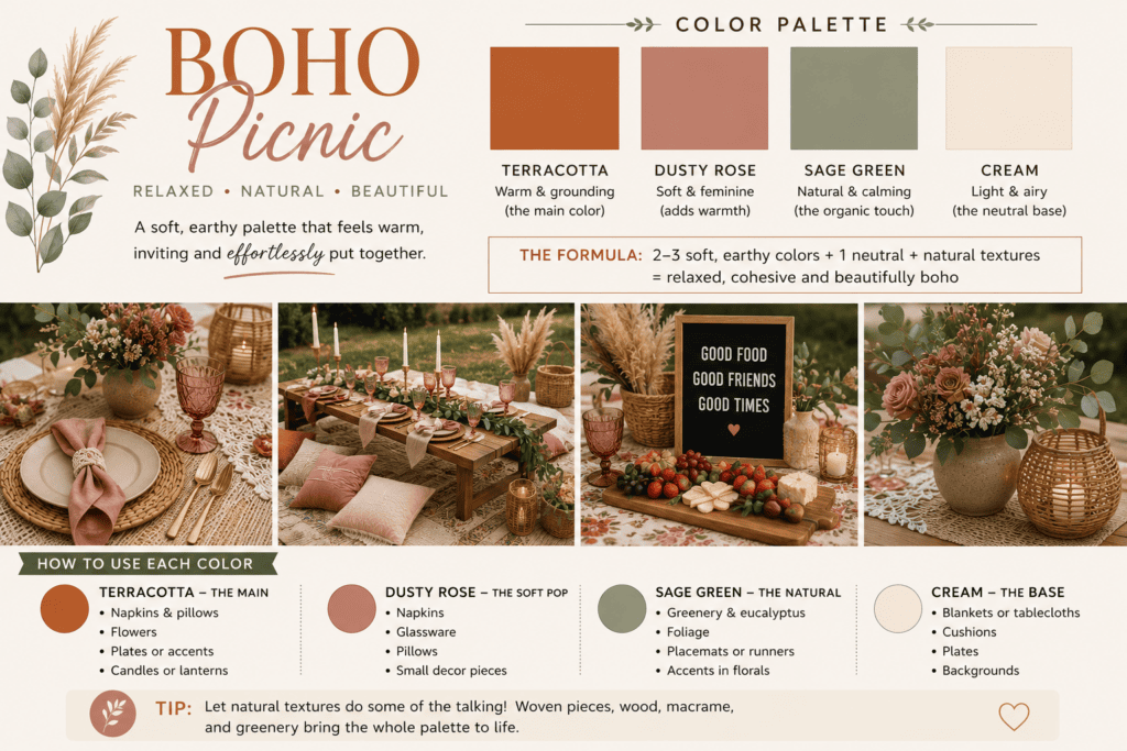
Boho Picnic: Terracotta + Dusty Rose + Sage + Cream
A boho picnic is a great example of a palette where the colors don’t need a lot of contrast to be interesting.
Instead, I’d use muted, earthy shades that all feel like they belong together.
Terracotta adds warmth and becomes the strongest color in the palette.
Dusty rose adds a softer touch without feeling overly pink.
Sage green brings in a natural element.
Cream keeps the whole setup light and gives the other colors room to stand out.
This is also where texture can do a lot of the decorating for you. Woven baskets, natural wood, linen-look fabrics, dried flowers and rattan pieces all reinforce the palette without adding more colors.
You could use cream blankets or table linens as the base, then bring in terracotta and dusty rose through pillows, napkins and flowers. Sage can come naturally from greenery.
The formula:
Muted warm colors + soft green + creamy neutral + lots of natural texture = relaxed and pretty without trying too hard.
Shop Solid-Color Party Supplies on Amazon
Choose a color to shop coordinating party supplies.
Some links go to my Amazon Idea Lists. As an Amazon Associate, I earn from qualifying purchases.
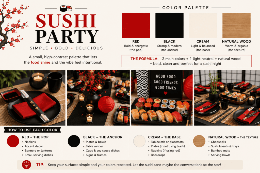
Sushi Party: Red + Black + Cream + Natural Wood
A sushi party shows how a small, high-contrast palette can make a simple at-home dinner feel like an actual event.
I’d start with black as the grounding color and use deep red as the stronger accent.
Then add cream or warm white so the setup doesn’t become too dark.
Finally, instead of introducing another color, use natural wood or bamboo as part of the palette.
That could mean bamboo chopsticks, wooden serving boards, sushi trays or woven placemats. The natural material adds warmth while still keeping the overall look clean.
And because the food itself is colorful, the table doesn’t need a dozen decorative colors competing with it.
The formula:
Black + deep red + a light neutral + natural wood = simple, bold and perfect for a sushi night.
Shop Solid-Color Party Supplies on Amazon
Choose a color to shop coordinating party supplies.
Some links go to my Amazon Idea Lists. As an Amazon Associate, I earn from qualifying purchases.
You Don’t Have to Use Every Color Equally
This might be one of the easiest ways to make a party palette look more polished.
If your palette has four colors, that doesn’t mean you need exactly 25% of each.
Choose one or two colors to dominate.
Then let the others support them.
For an elegant retirement party, black and cream might cover most of the room while gold appears only in smaller details.
For the luau, turquoise and natural tan could cover the large surfaces while coral and green provide color.
For an Over-the-Hill party, black and white can dominate while red and yellow pop up in the funny decorations.
That hierarchy keeps the room from looking like you emptied four packages of party supplies onto the table and hoped for the best.
Use Solid Colors for the Basics
This is probably the Party Time lesson I use most.
Once you have your palette, buy the boring stuff in coordinating solids.
And I mean boring in the nicest possible way.
Think:
- tablecloths
- plates
- cups
- napkins
- utensils
- serving trays
- balloons
- runners
Then spend your themed-decorating budget on the things that actually make an impact: a banner, centerpiece, cake topper, photo backdrop, a few printed decorations or one really fun statement piece.
You don’t need tropical-print plates and tropical cups and tropical napkins and tropical tablecloths to prove you’re having a luau.
We got it from the giant hibiscus flower. 🌺
Shop Coordinating Party Supplies
Shop Solid-Color Party Supplies on Amazon
Choose a color to shop coordinating party supplies.
Some links go to my Amazon Idea Lists. As an Amazon Associate, I earn from qualifying purchases.
Repeat Your Colors Around the Party
Once you’ve chosen your palette, repetition is what makes everything look intentional.
If you’re using coral at a luau, don’t put one coral napkin on the buffet table and call it a day.
Repeat it.
Coral napkins at the tables. A few coral flowers in the centerpiece. Coral balloons mixed into the balloon arrangement.
The colors don’t have to appear everywhere, but repeating them in several areas visually ties the party together.
Don’t Forget Texture and Natural Materials
Color isn’t the only thing creating the look.
Natural wood, woven chargers, greenery, glass, metallic finishes and fabric can all become part of the palette without introducing another actual color.
That’s especially useful when you’re trying to keep a party from looking overly themed.
For the luau, natural woven textures reinforce the tropical feeling.
For the elegant retirement party, metallic gold and glass make the simple palette feel more special.
Sometimes the thing your color palette needs isn’t another color at all.
The Easiest Way to Know If Your Party Colors Work
Before buying everything, put your colors next to each other.
That can be as simple as laying a napkin beside a plate and a tablecloth in the store.
Or take screenshots of the products you’re considering and put them together on your phone.
Ask yourself:
Is there one clear main color?
Do I have enough contrast?
Is there a neutral somewhere?
Am I repeating the same few colors—or accidentally introducing seven more?
If everything looks a little busy, don’t automatically add something.
Take a color away.
That’s often the fix.
Final Thought: Coordinated Is Better Than Perfectly Matched
The goal isn’t to find four products manufactured in exactly the same shade of turquoise.
In fact, a party can look more interesting when the colors coordinate without being perfectly identical.
Start with your theme. Pull out a few colors you love. Add a neutral. Use solid-color basics for most of the setup, and let a handful of themed decorations do the fun part.
That’s essentially what I learned all those years ago at Party Time, and it’s still one of the easiest ways I know to make a party look like you planned the whole thing on purpose.
Even if you were standing in the party aisle 20 minutes earlier debating Red Rose versus Dusty Rose. 😂
Lisa Thompson
 Hi, I'm Lisa, a software engineer, photographer, and creator behind Redcypress Designs. I share practical home solutions, beginner-friendly juicing tips, cozy living ideas, Pinterest experiments, and products that solve real everyday problems. Most of the projects, recipes, and reviews on this site come from my own experiences, testing, and occasional mistakes.
You May Also Like
How to Plan a Party at Home That Feels Put Together
How to Host a Bridge Party at Home: A Cozy, Modern Take on Bridge Night
